
Grapology
Brand Identity
Case Study
2024
A Museum from Concept to Creation
Grapology
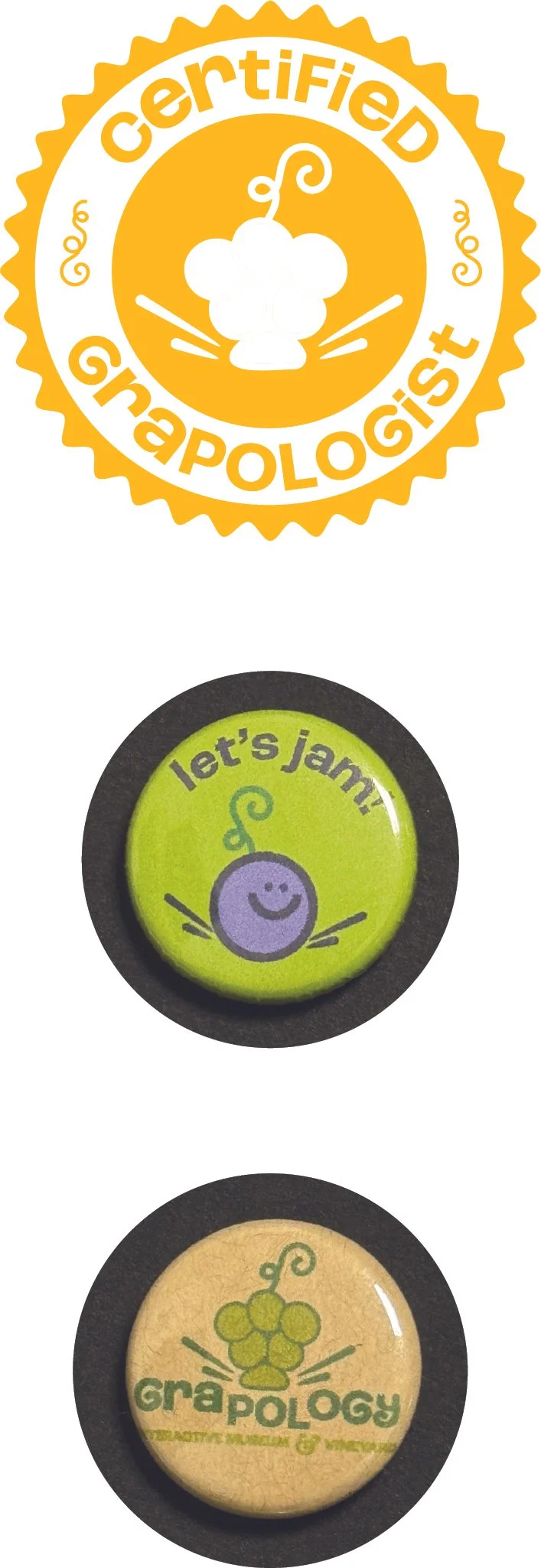
Logos
Business Card
Letterhead
#10 Envelope
A2 Envelope
A2 Card
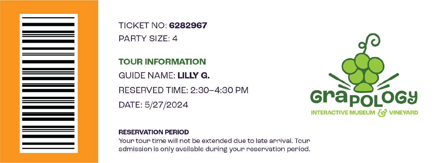
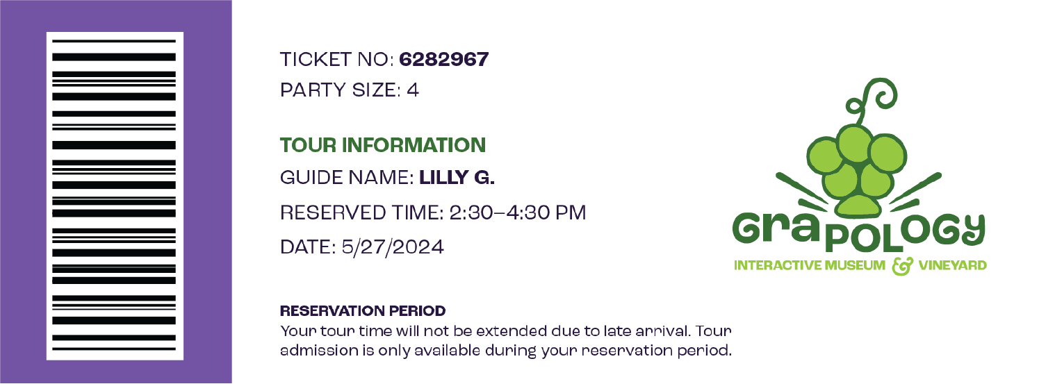
Tickets
Flyer
Buttons
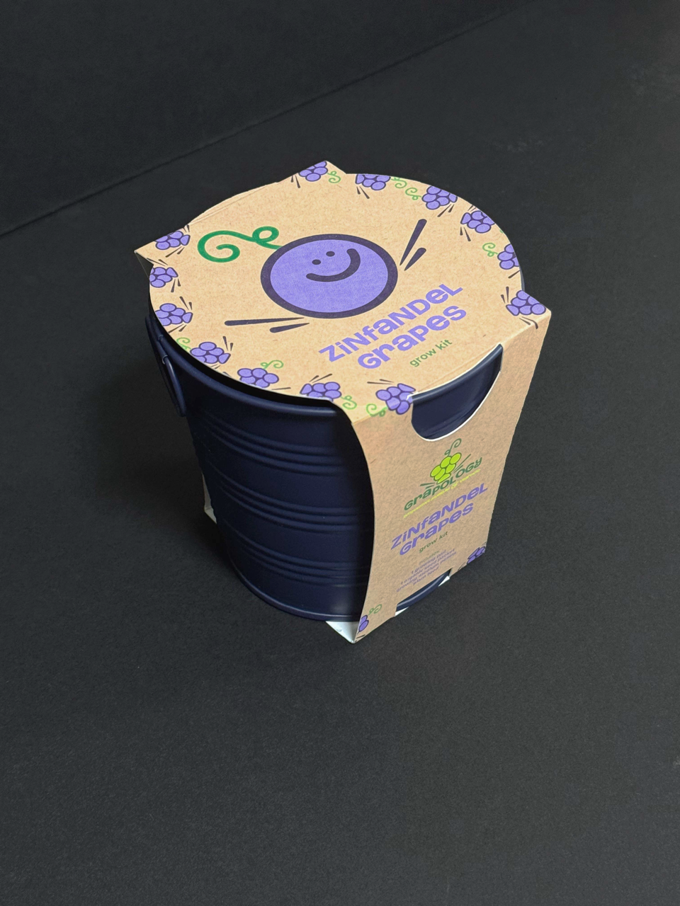
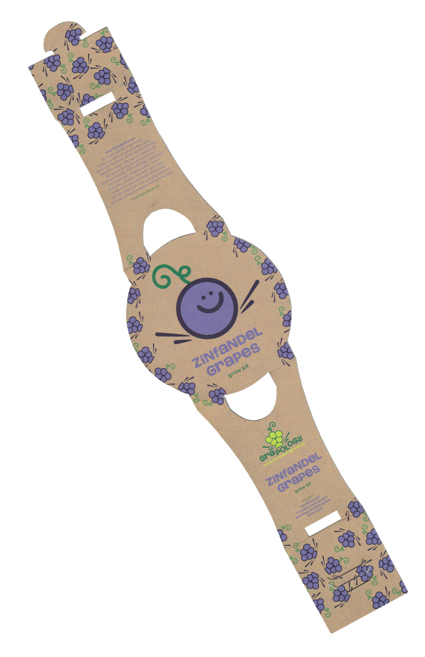
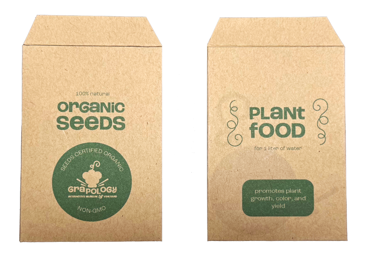
Grow Kit and Seeds
Deliverables
Photoshop
Illustrator
InDesign
Procreate
Cutting/Scoring Tools
Button Maker
Tools Used
Concept
Fictitious Interactive Children’s Museum
The challenge was to create a brand identity that was both educational and visually appealing for children, capturing the essence of the vineyard while staying playful and engaging. The project needed to balance informative content with an exciting, kid-friendly approach.
The Challenge
I aimed to create an atmosphere that reflected the organic, natural roots of Grapology’s offerings while emphasizing the hands-on, interactive nature of the experience. A main goal was to make kids excited to engage with the wonder of grape growing and jam/juice production in a way that encourages exploration and creativity.
The Goal
The final visuals feature both business applications and extended identity collateral, which are both clear and intuitive for children and parents. Each piece of collateral is engaging using bright purples and greens, playful handwritten typography, and friendly character illustrations that help to create a lively, interactive atmosphere that encourages children to learn while enjoying the experience.
The Solution
Grapology
Moodboard
Approach
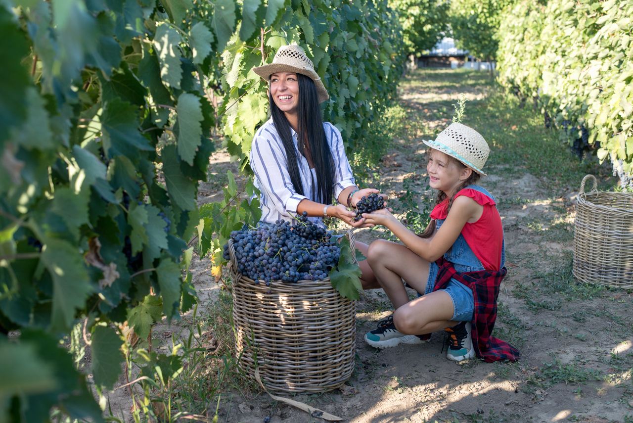
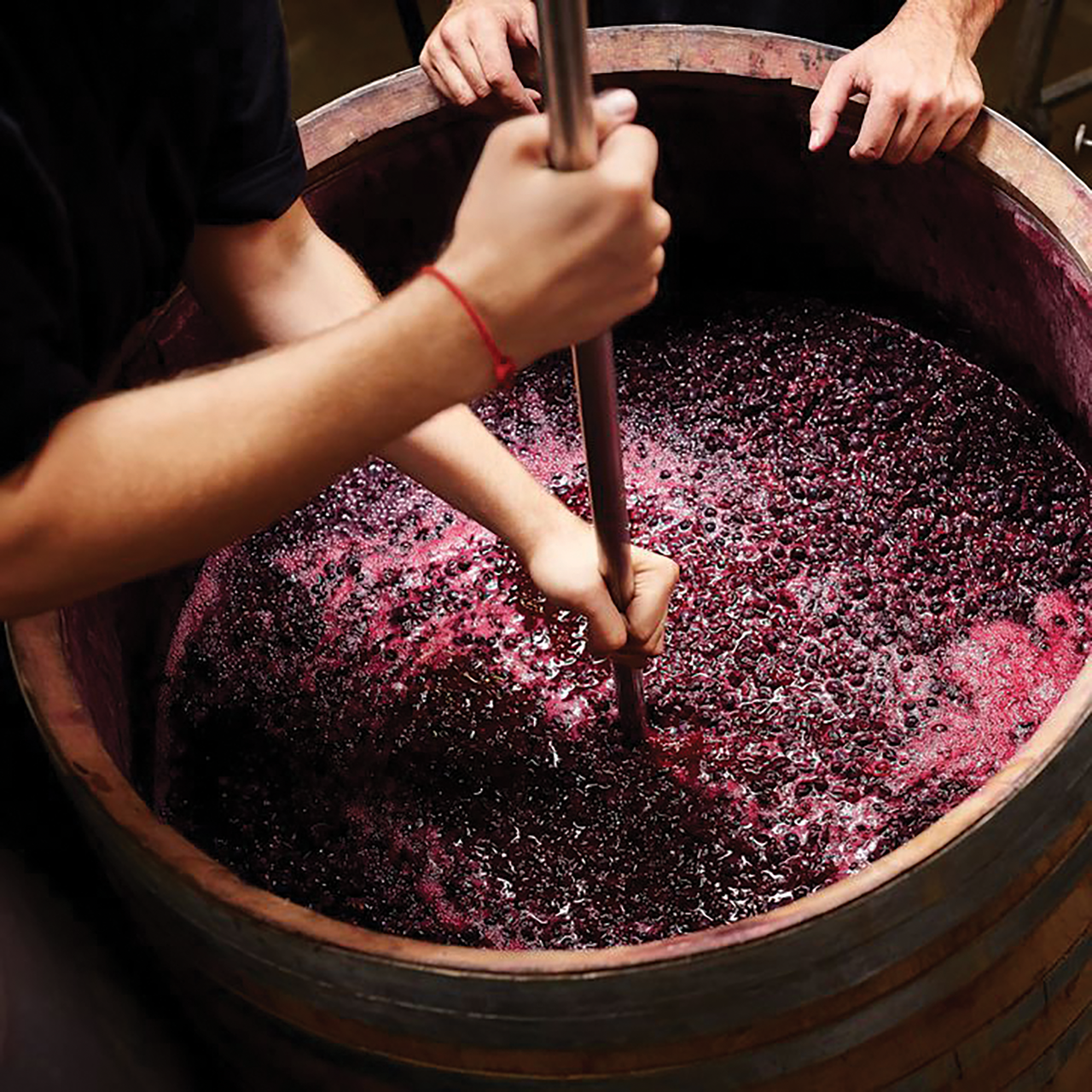
Squeeze, crush, mash, mix! Grapology is a fictitious children’s grape museum and vineyard in Sacramento that provides a unique, hands-on experience for children and parents. With its guided tours, Grapology educates their visitors on the beginning stages of the grape gardening process including growing, gardening, harvesting. Then, children engage in the production process of crafting their very own sample of artisanal, organic jams and juices with grapes originating in the Sacramento Area.
Logo
Grapology
The finished logo consists of a bundle of grapes crashing against the name “Grapology”, displacing the “pol”. This ties back to the museum’s unique grape production process, which involves our visitors smashing and crushing grapes into jams and juices. To further express this, I added small expression marks on either side of the grapes to represent the juice that is pressed out from this process.
The G and the Y letters have matching curls with the vine at the top of the grapes, making the logo feel cohesive and integrated. Also, I have custom-made the ampersand in the tagline “Interactive Museum and Vineyard”, to also have similarity to the vine.
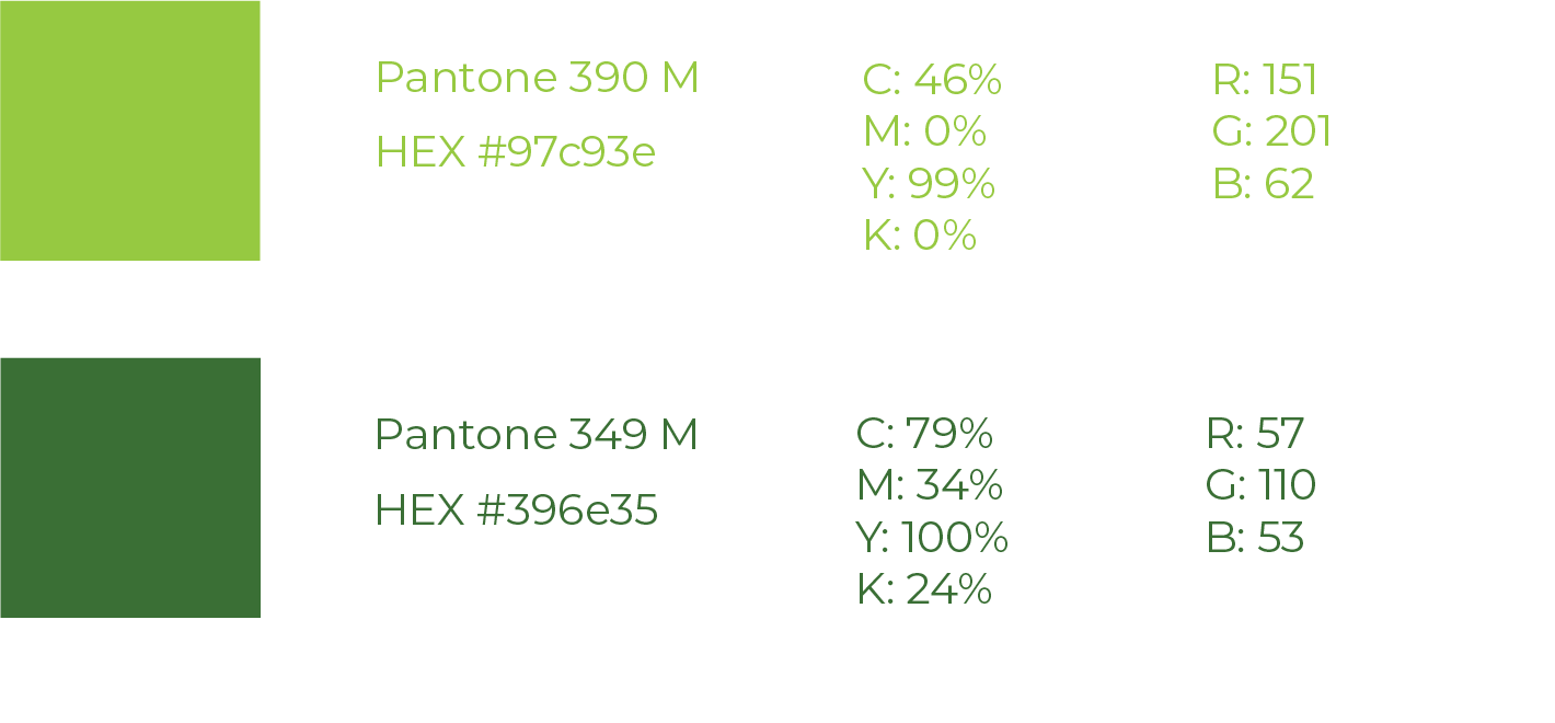
This analogous green color scheme features two types of green, Pantone 390 M and Pantone 349 M. I chose this green color scheme to represent 1 of the signature grapes that is grown in the vineyard, the Sacramento native Chardonnay grape. The Chardonnay grapes are known for their vibrant, yellow green grapes and rich green leaves.
Approach
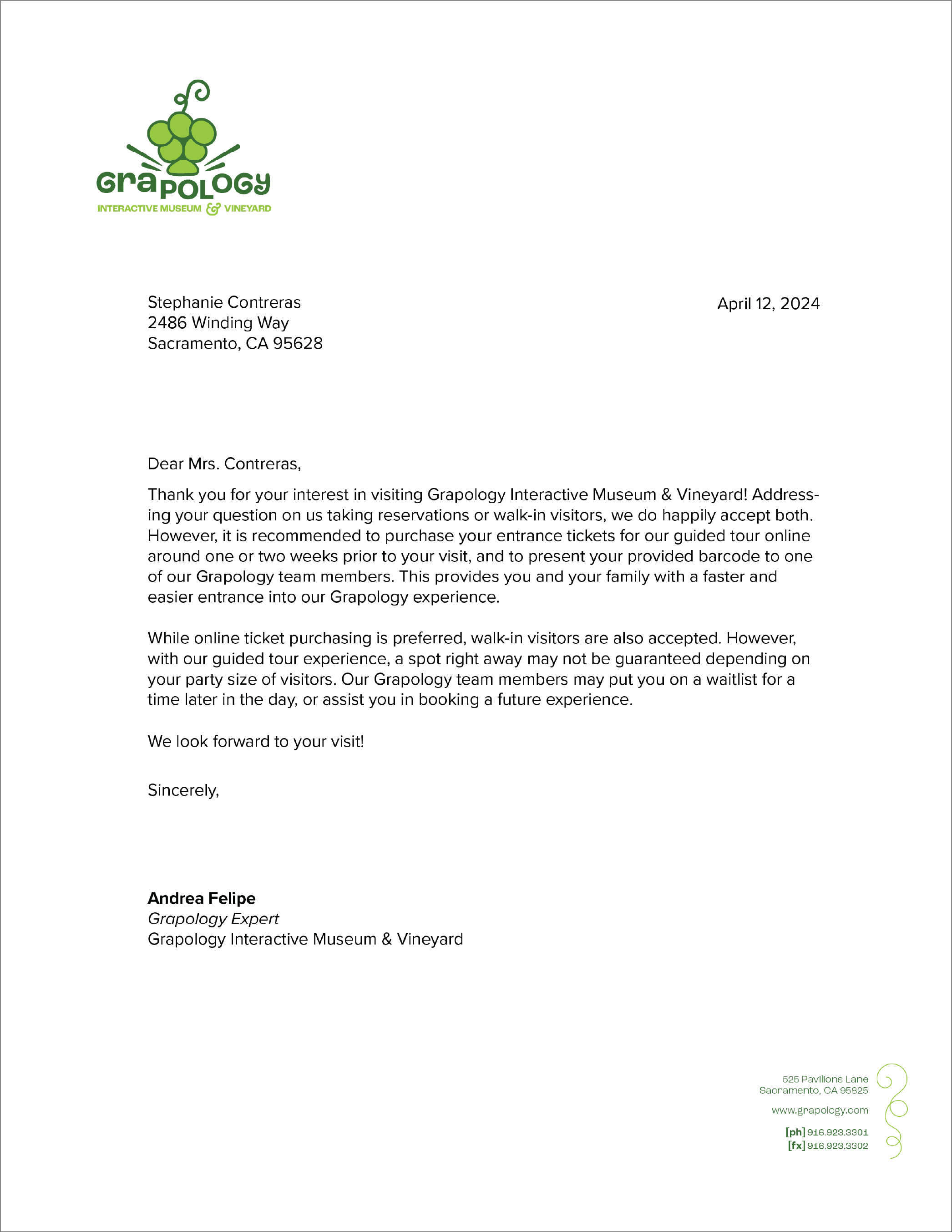

Business Applications
Grapology
While Grapology is a children’s museum, its design and branding also offer strong business applications. Its visual identity can be adapted for professional settings, as presented in the letterhead, business cards, and #10 envelope. This is done by extracting elements from the original logo and also creating additional harmonious elements. An example of this would be the watermark on my business card, and the pattern on the A2 card.
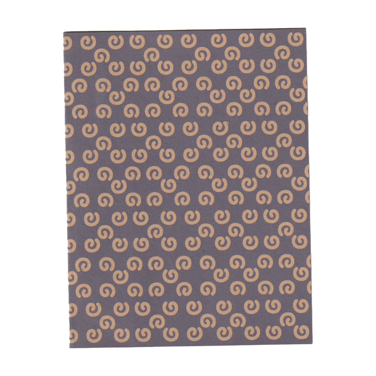
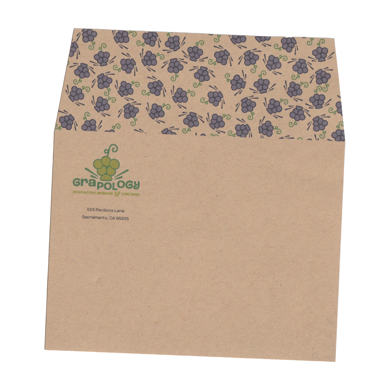
The A2 card and A2 envelope introduce the supplemental color of purple into the branding, representing the second signature grape that Grapology grows, the Zinfandel grape.
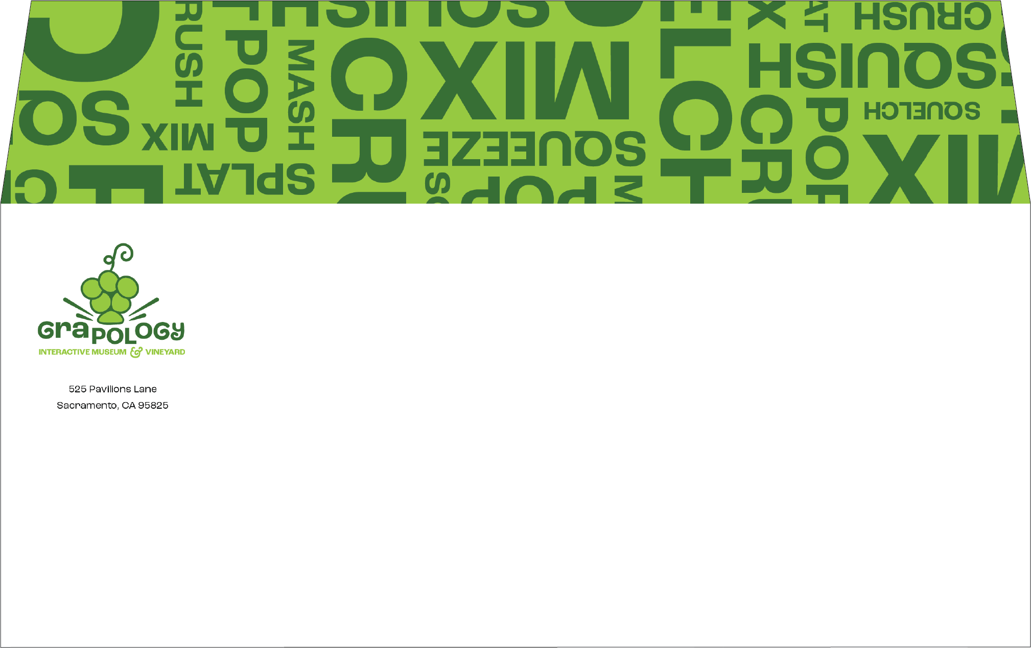
The #10 envelope includes key action words that will be performed by the visitors during their time at the museum, including the words “mix, crush, squish, and squeeze”. This adds an auditory sense into the branding, really helping the viewer feel and envision their experience here at Grapology.
Details
Extended Collateral
Grapology
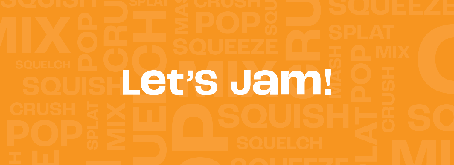
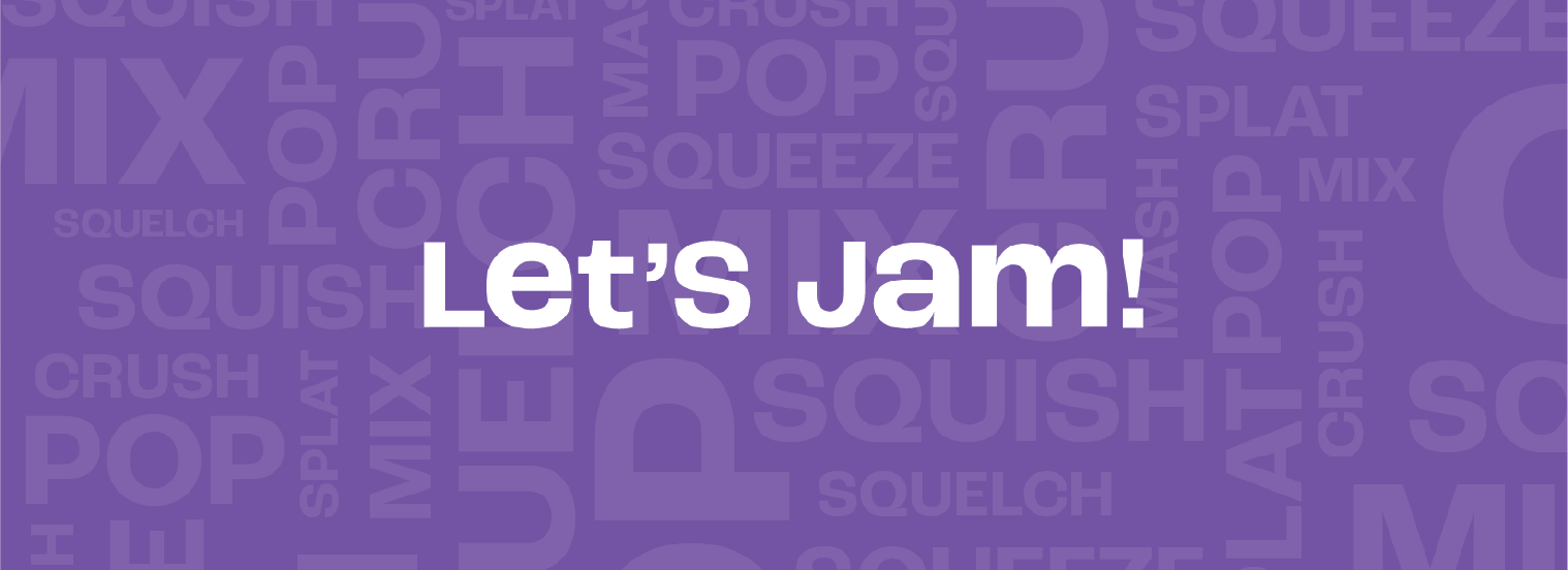
My tickets say “Let’s Jam!” which is a fun and exciting phrase that gets the audience excited for their upcoming experience.
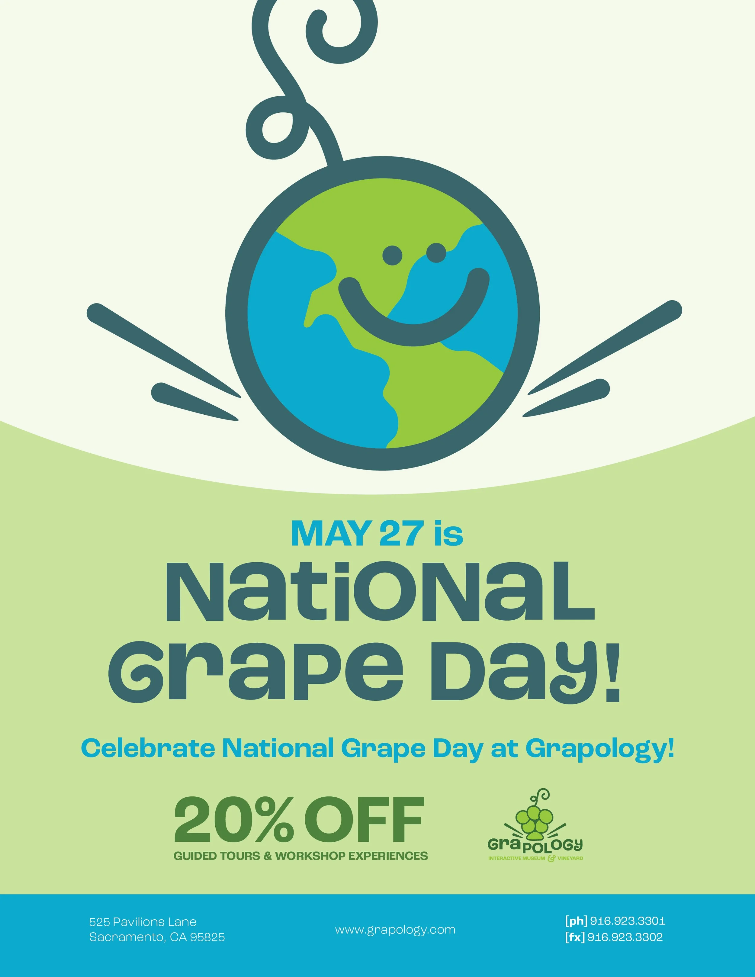
Looking at this 8.5 x 11 flyer, this is an example of how despite a color palette change, the recognizable illustrations and type still help the flyer look like Grapology branding.
Branded buttons will be handed out to the kids at the end of their visit. After their museum experience, these children will be proud and excited that they know how to create these homemade and delicious jams and juices. I wanted these buttons to inspire confidence and achievement within the visitors.
The Grapology grow kit allows children to take the Grapology experience home with them, with their very own Zinfandel grape seeds and plant food. This creates a resonating experience for all of our visitors.
Details
A Museum from Concept to Creation
Grapology
Customized Typography
Illustration
Visual Identity Design
Print Production
Visual Cohesion
Packaging Design
Key Skills Used
Date Completed
2024
This project challenged me to merge nostalgia with modern design in a way that felt authentic to Silk Sonic. I enjoyed pushing their retro aesthetic into a fresh direction, while still honoring the soul and funk that define their sound. It was both a highlight and a challenge exploring how sound impacts visuals and vice versa. Overall, I’m proud of how these covers came out and how they truly fit with the sound and aesthetic of Mars and .Paak.
Conclusion