
Jazz Poster Series
Artist Branding
Poster Design
2024
The Look of Sound
Jazz Poster Series
Deliverables
11x17 Posters
Photoshop
Illustrator
InDesign
Procreate
Tools Used
Concept
Fictitious Concert Promotion
The challenge of this series was to create five promotional concert posters that visually represent the unique style and energy of the performers.
The Challenge
I aimed to create designs that would reflect the essence of each artist’s musical identity through striking visuals, color, and typography. The artists featured in order are: Thundercat, Gregory Porter, Robert Glasper, Snarky Puppy, Monophonics.
The Goal
Beyond aesthetics, this project demonstrates my strong understanding of hierarchy and how these posters function in a setting where the viewer examines the poster from afar. The posters ensure clear communication while encouraging the viewer to seek out the finer details in the poster, maintaining artistic impact, making them effective promotional tools for live music events.
The Solution
Jazz Poster Series
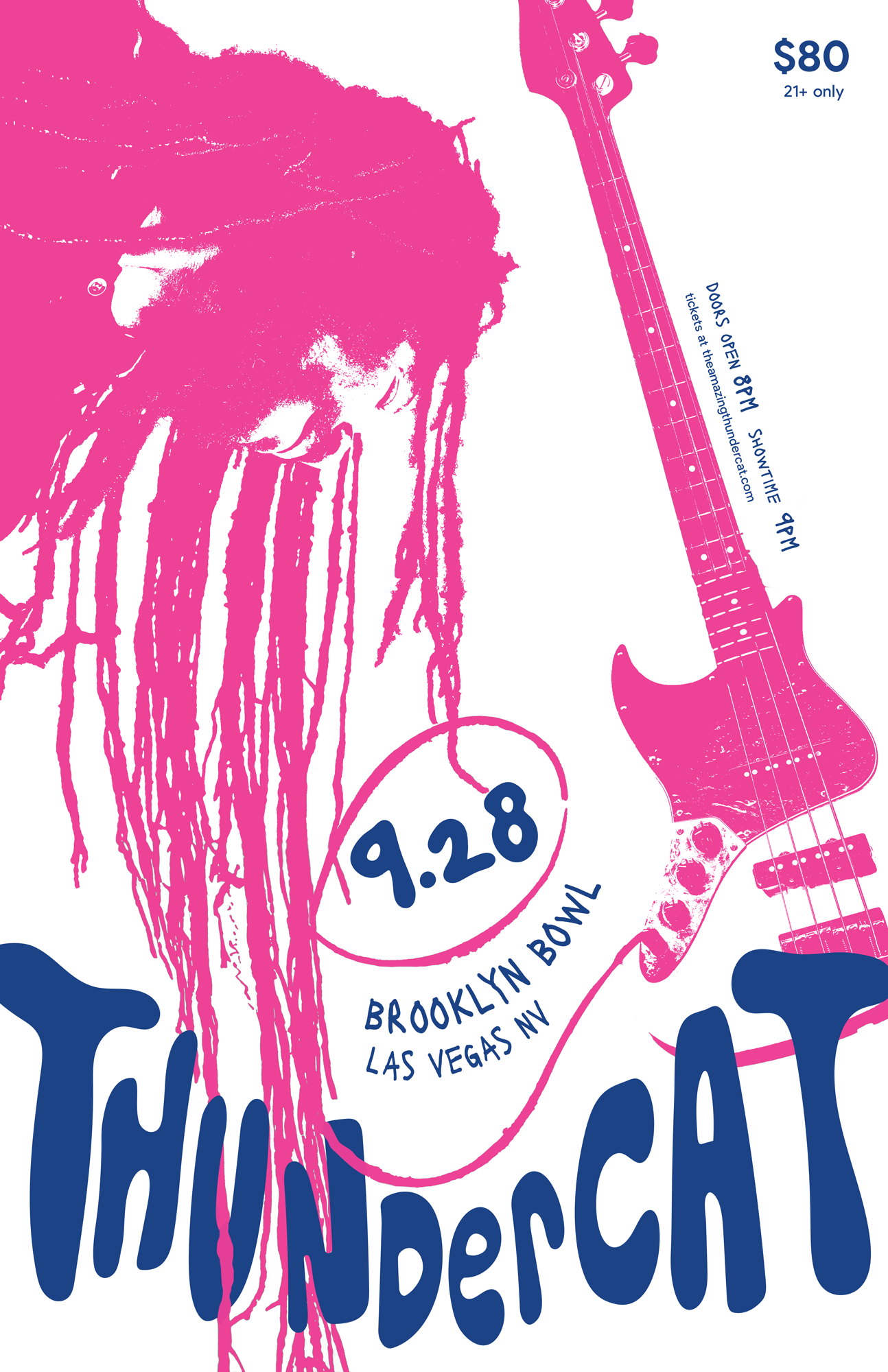
Thundercat
Approach
My Thundercat poster design blends hand-drawn bubble type with the flow of the hair, in which a single dread transforms into the cable of a bass guitar. With Thundercat being an African-American bassist, I felt this approach fit his style well. His genre being psychedelic funk inspired my flowing, ever changing composition. This poster was restricted to two colors, so the funk genre reflected my vivid pink and blue color choices.
Jazz Poster Series
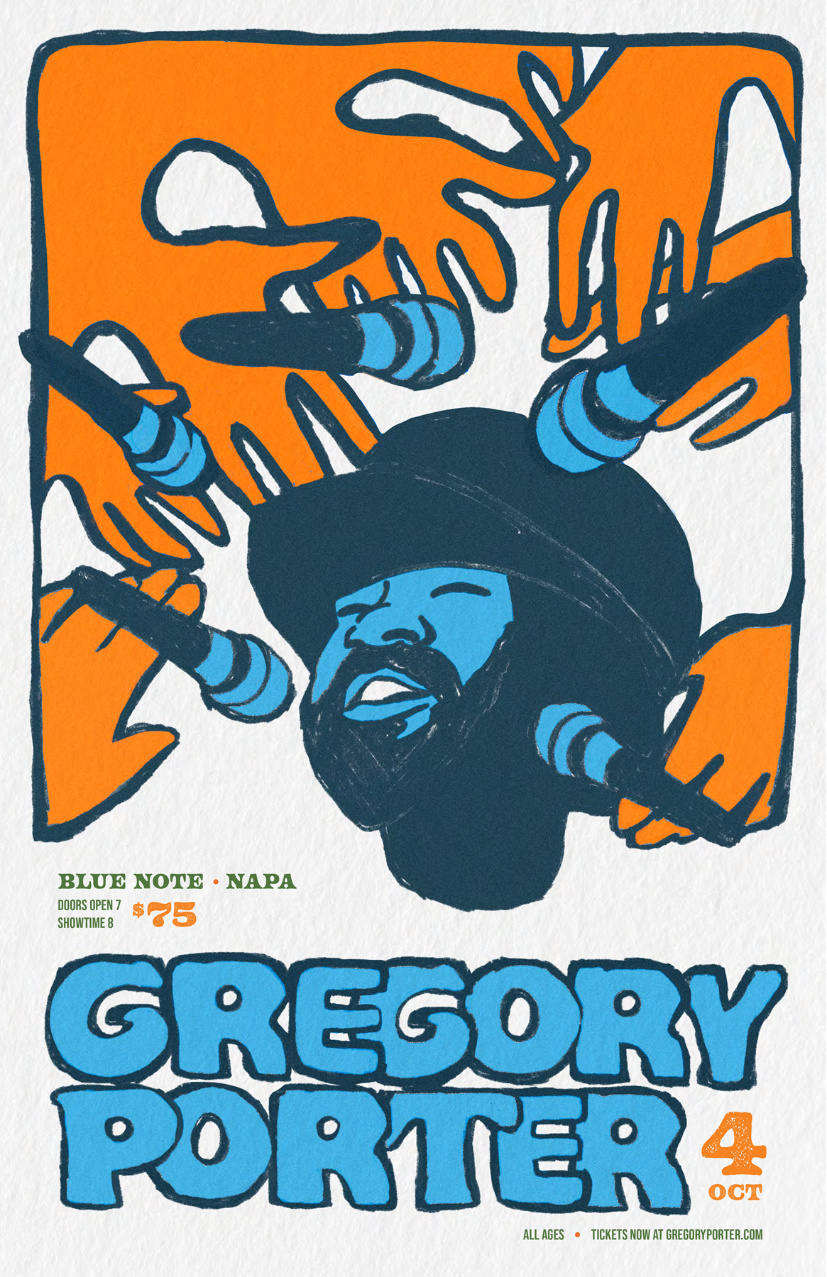
Gregory Porter
Approach
Porter’s baritone vocals inspired this poster design, with abstracted hands all yearning for a chance to hear his voice. I further accentuated his vocals in the typography, having it bold and bright to represent the rich and complex tones of his voice. I mainly used a complementary color scheme of orange and blue to symbolize the highs and lows of his jazz, blues, and gospel sound.
Jazz Poster Series
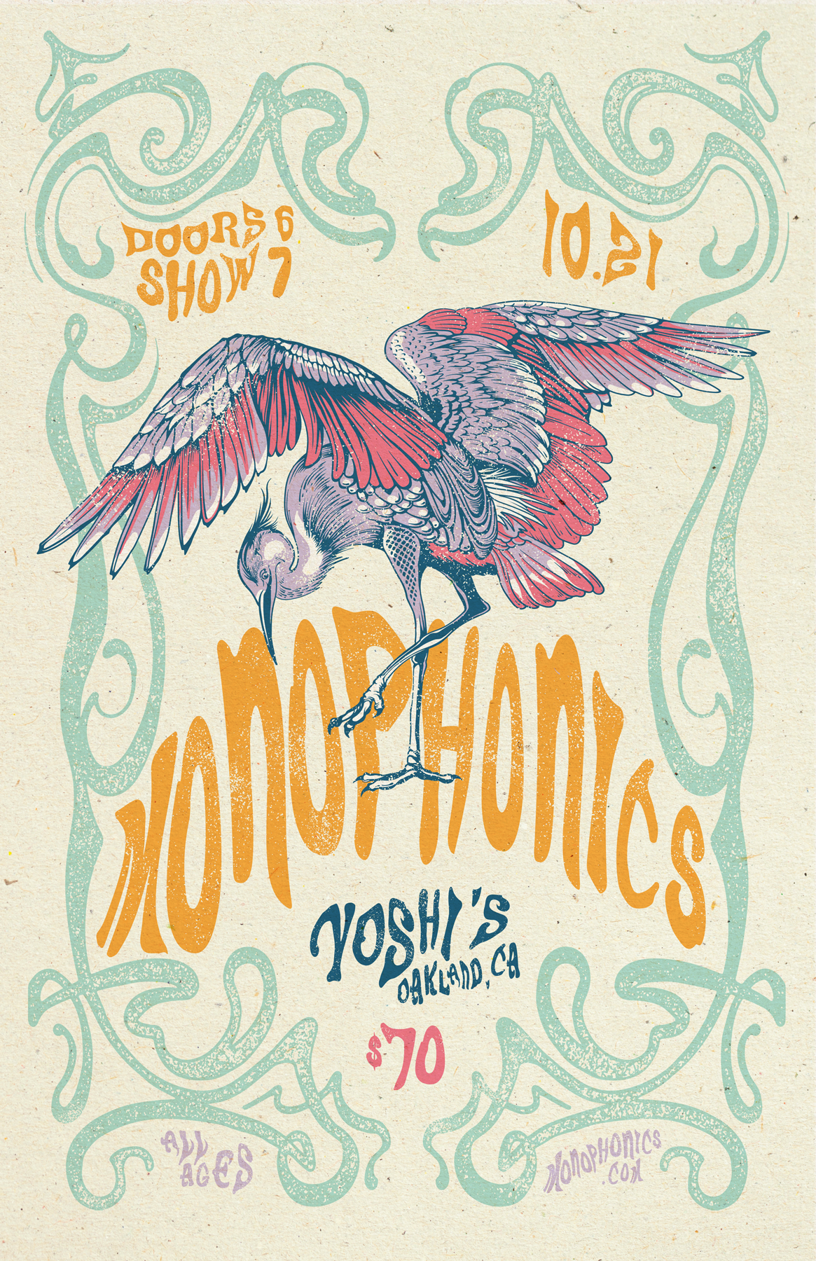
Monophonics
Approach
To capture Monophonics’ genre of psychedelic soul and R&B, I implemented a crane which symbolizes their soulful and transformative sound. With the poster’s Art Nouveau inspired design, this mirrors Monophonics’ lush, layered, and vintage sound. The colors are mainly muted and pastel, invoking a sense of expression and romanticism found in their music.
Jazz Poster Series
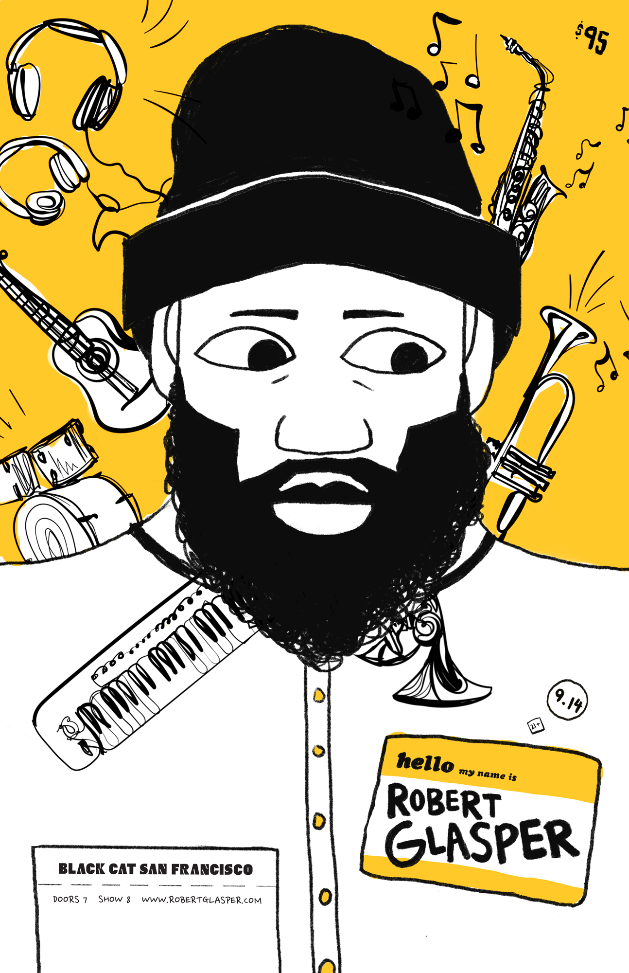
Robert Glasper
Approach
This poster’s style took inspiration from Glasper’s background as a producer and arranger, including various instruments found in his works. This poster was restricted to two colors, so I kept the color palette and style simple, instead highlighting the versatility of Glasper’s work through the elements found in the design.
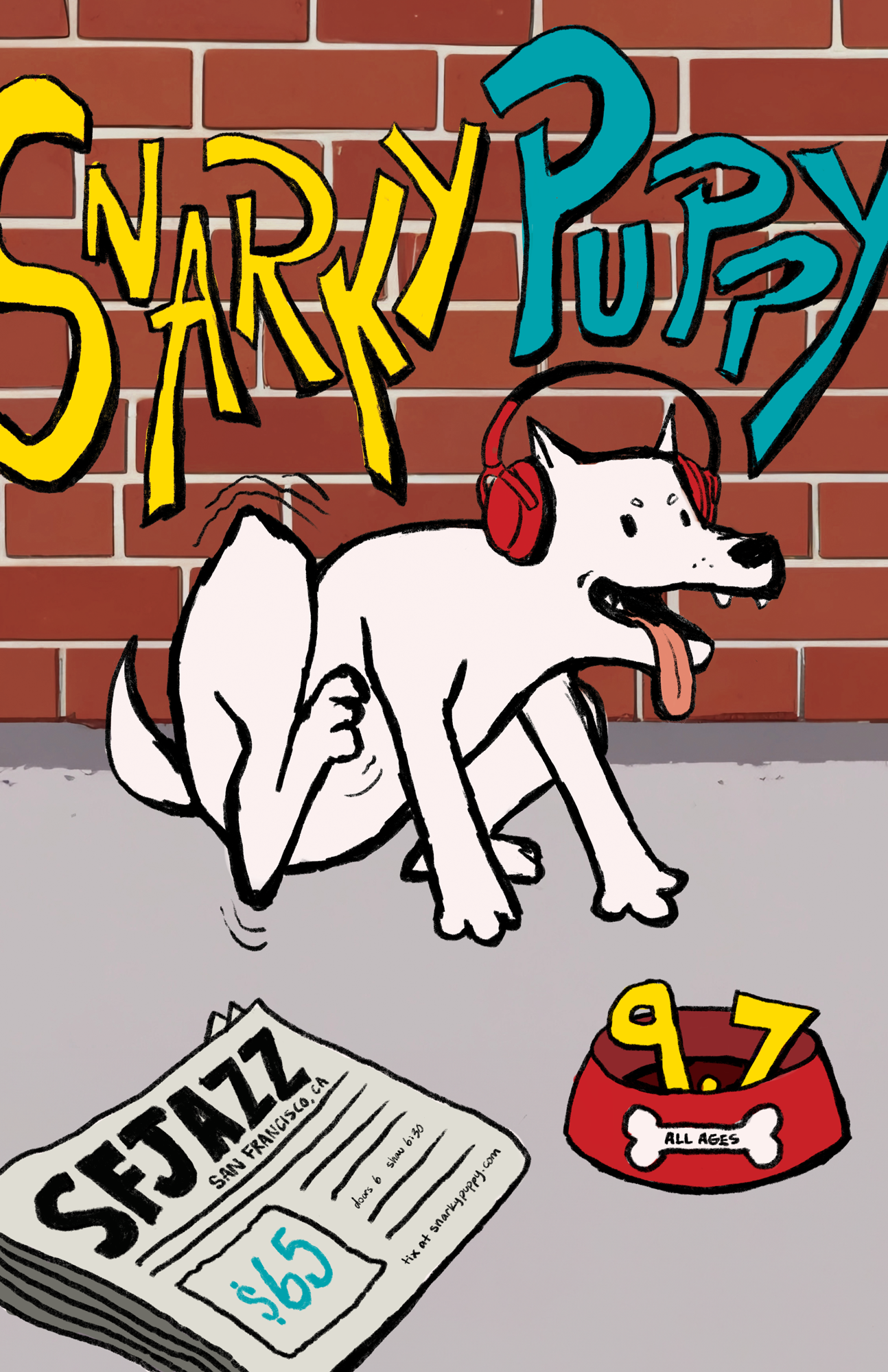
Jazz Poster Series
Snarky Puppy
Approach
I implemented one of Snarky Puppy’s album covers, The Only Constant, as the main visual element for this poster. The album consisted of a dog with headphones against a brick wall and sidewalk, so I reimagined that concept into something more visually appealing and illustrative. With Snarky Puppy’s genre being jazz fusion with elements of rock, world music, and funk , I wanted to change the visual style to be more modern and interactive, making informational elements very integrated within the piece.
The Look of Sound
Jazz Poster Series
Poster Design
Artist Representation
Typography
Color Theory
Composition & Layout
Series Cohesion
Print Production
Illustration & Graphic Elements
Event & Promotional Design
Key Skills Used
Date Completed
2024
This project taught me how to visually interpret sound, and how rhythm, tone, and personality can be expressed through shape, color, and layout. I enjoyed the challenge of adapting my design choices to reflect such a range of artists while maintaining cohesion across the series. It deepened my appreciation for the connection between music and design, and reinforced my ability to create visually engaging work that communicates both at a distance and up close.
Conclusion